
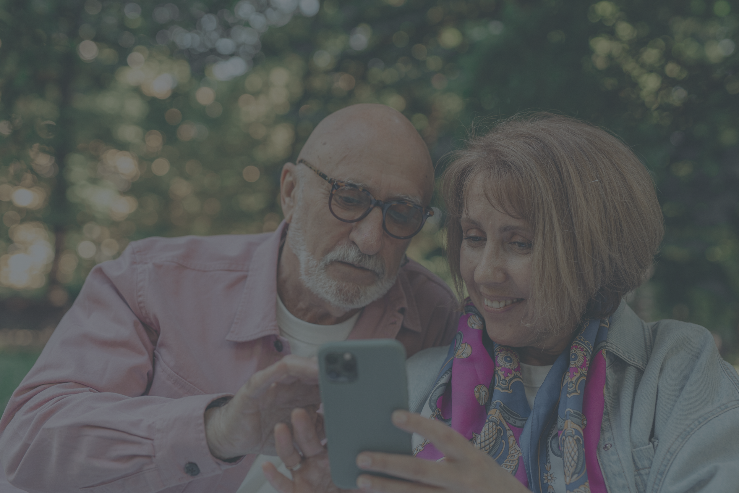

SCHOOL PROJECT
UX Design for Financial Inclusion: Creating an Accessible Banking App for Seniors (Chase Re-Design)
Optimizing Senior Experience: Transforming Chase UI for Enhanced Accessibility, User-Friendliness, and Financial Inclusion
TIMELINE
2023. 11. - 2023. 12. (5 Weeks)
PROJECT TYPE
UX Design, Mobile UI Design, Service Design
TEAM (2)
Sohee Kang, Tiffany Nguyen
MY ROLE
Research, Wireframing, Prototyping
PROBLEM STATEMENT
While banking apps have become indispensable for customers by providing convenience and operational efficiencies for banks, there is a notable gap in meeting the expectations of senior citizens. Our observations, interviews, and literature research suggest that existing banking apps may neglect the unique needs of seniors, potentially undermining their dignity as users.
How might we help seniors become more proficient with these apps without overwhelming them, while ensuring that their specific needs are taken into account?
The current banking apps pose challenges for senior users, characterized by:
Tech Literacy Gap: Seniors struggle with the app due to limited tech skills.
Discomfort with Updates: Continuous changes cause unease among seniors.
Information Retrieval Issues: Difficulty in finding specific features hampers user experience.
Accessibility Barriers: Seniors with low vision or physical limitations face usability challenges.
Additionally, the decline in branch density, fueled by technology investment and the rise of digital banking, exacerbates the issue. Seniors may need to travel long distances, creating a significant hurdle unless they overcome the digital divide.
BREAKDOWN OF SOLUTIONS
Make the home screen easy to use with minimal information overload.
Offer upfront help
Offer step-by-step guidance, and practice for beginners to master essential skills..
To provide a glimpse into the future of banking apps, we selected "Chase" as an example of a popular mobile banking app in the US. We then redesigned the home screen and improved the app's learnability by adding “Learning“ on the main menu.
FINAL DESIGN
-
![Easy home toggle for beginner users]()
Easy home toggle for beginner users
In many cases, UI is updated, and some users, especially senior users, find it hard to get used to the newer one. Therefore, the app should guide its users if there's any big UI difference compared to the previous one.
-
![Make it simple but visible enough]()
Make it simple but visible enough
The existing home screen has a lot of information and shortcuts. However, "Easy Home" got rid of less important items to lower its information density and included more labels as possible to explain what happens when users interact with buttons or any other elements.
-
![Step by step guide with fictional scenario]()
Step-by-step guide with fictional scenario
Learning content uses fictional characters as guides to simplify understanding.
-
![]()
Practice with Real Life Scenario
After following the step-by-step guide, you will get the chance to practice on your own through more realistic virtual scenarios.
-
![]()
Intrinsic Rewards
Upon successful completion of each module, users are rewarded with a congratulatory screen and the ability to level up, showcasing their progress. However, the greatest reward is the confidence gained in their newfound abilities.


PERSONA
This persona was created based on our literature research and interview results. He represents our target users, who are not tech-savvy, uncomfortable with continuous digital interface updates, struggle to find their specific needs in the app, and have low-vision/ other physical limitations.
CONCEPT MAP
This concept map broke down the 5W1H of this project to demonstrate thoughtful consideration of the dignity-related factors associated with ensuring seniors' equal access, financial autonomy, and self-confidence through the banking app. This project aimed to address merit, human rights, and autonomy through design.
JOURNEY MAP
PROTOTYPE (Figma)
REFLECTIONS
Given more time on the project, I would have prioritized the following aspects:
Content Enrichment
Rationale: While the project scope was well-defined, additional time would have allowed for the incorporation of more content, especially in areas like the help chat and learning features.
Impact: This would have provided a more comprehensive view of the app's capabilities and further demonstrated its user-friendly nature, catering specifically to seniors' needs.
User Testing with Seniors
Rationale: User testing with target users is crucial for obtaining authentic feedback on the app's usability and accessibility.
Impact: Testing would have uncovered potential pain points, allowing for iterative improvements to enhance the overall user experience and ensure that the app meets its intended audience's diverse needs. Also, depending on the result, I would revisit the design system to ensure every component is easy to interact with.